Five easy-to-use "contrast checkers" for those in charge
2024/07/29
Contrast Checkercalculates the contrast ratio between foreground color (text and graphic elements) and background color on websites and images, that is, the difference in brightness,and to check if that ratio complies with web accessibility guidelines such as WCAG and JIS.A tool for evaluatingIt is referred to as a contrast ratio checker or color contrast checker.
In this article, I will introduce five representative contrast checkers as follows.
② ColorTester
③ AdobeColor
④ WCAG Color Contrast Checker
⑤ ContrastGrid
Along with the introduction of these tools, we will also elaborate on points to consider when checking contrast ratios, soIf you are responsible for web accessibility, please refer to this article.
Table of Contents
Five User-Friendly Contrast Checkers for Accessibility Staff
There are various types of contrast checkers that are essential for designers and accessibility personnel to verify the contrast of their company's website and web content.
Therefore, here we will discuss:A representative and easy-to-use contrast checker.We will introduce five. There are tools available for use on websites (browsers) as well as those that can be installed.Both are free tools available for use.We will introduce it, so please feel free to check the usability first.
| Tool Name | Features | Usage Environment |
| ① WebAIM | A tool that can be used immediately when accessing the site. The site is in English, but the UI is simple, easy to understand, and user-friendly. | Browser |
| ② ColorTester | It allows checking the contrast by dragging and dropping images. Being an installed type, its use in workplaces may be restricted. | Installation (Windows / Mac) |
| ③ AdobeColor | In addition to the contrast checking feature, it is equipped with numerous functions related to color combinations. It can also integrate with Adobe products such as Photoshop, Illustrator, and InDesign. | Browser |
| ④ WCAG Color Contrast Checker | Install it on Google Chrome and use it as an extension. It is a particularly useful tool for verifying the contrast of websites. | Browser (Chrome Extension) |
| ⑤ ContrastGrid | A tool to check the contrast of set colors in a list. Since multiple color codes can be set, it is easy for those unfamiliar with color combinations to understand and decide on which colors to use. | Browser |
① WebAIM
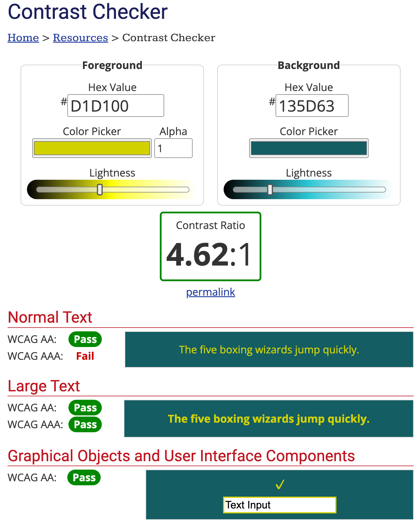
to set the text color (Foreground) and background color (Background) to calculate the contrast ratio,Check if it meets WCAG standardsYou can specify colors using color codes or a color picker, and adjust brightness as well. When you set a color, the contrast ratio is calculated in real time, and you can check the preview with normal text, bold text, and graphical objects like checkmarks.
Whether each result meets the conformance level is clearly shown at a glance as "Pass" or "Fail."The navigation is in English, but it is simple and easy to understand.So there shouldn't be any difficulty in typical usage.
Official Page:WebAIM
② ColorTester
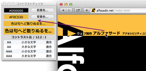
Calculate the contrast ratio of the two colors and evaluate it according to JIS X 8341-3:2010 (WCAG 2.0) standards.By dragging and dropping image files into the window, you can automatically infer and evaluate the foreground and background colors of the image..
This is a Japanese-made tool that supports both Windows and Mac OS.Installation of the tool is required.. The supported versions for each OS are Windows 8.1 and later, and Mac OS X 10.10 and later. There is also an English version.
Official Page:ColorTester
③ Adobe Color
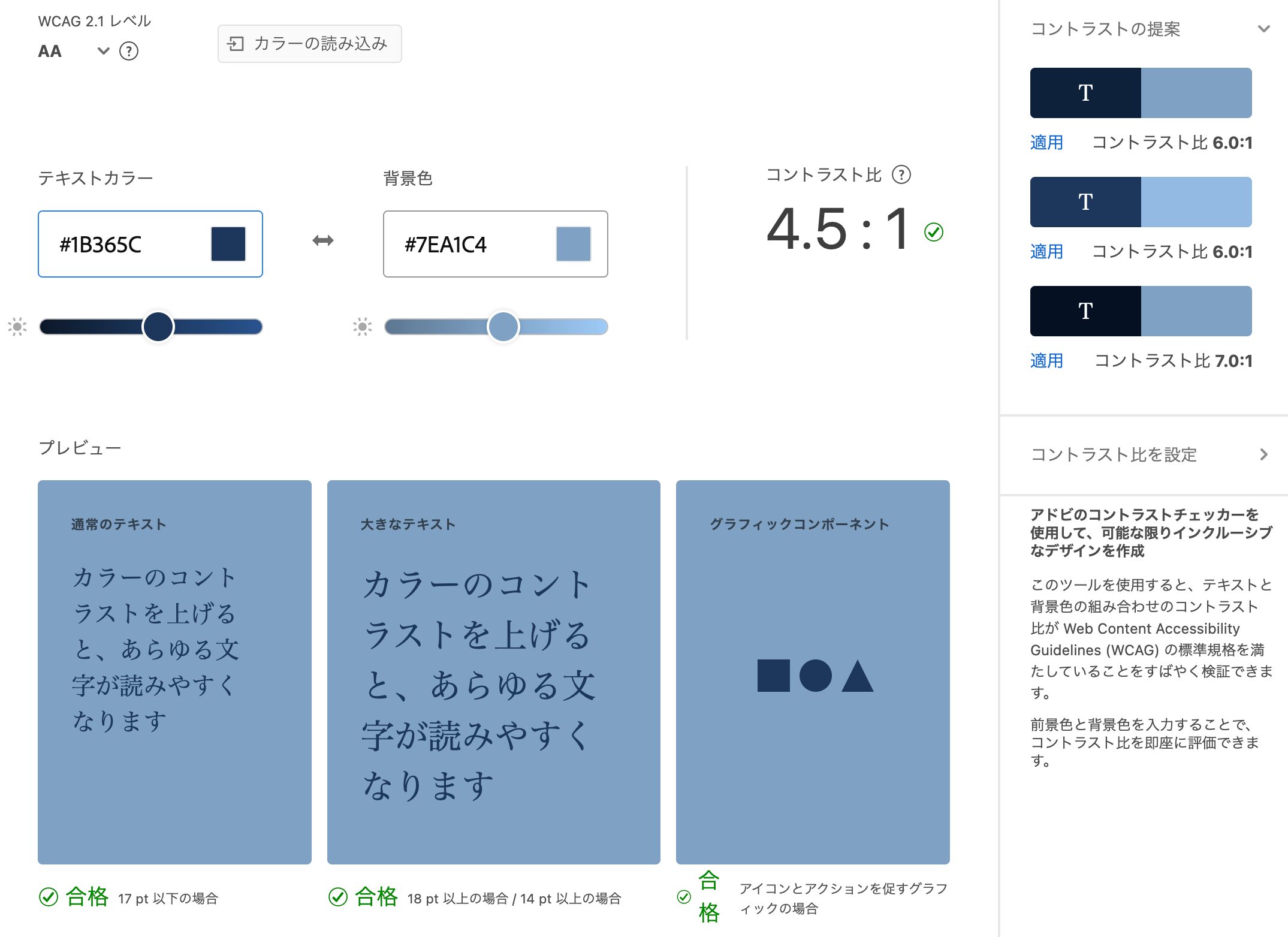
This tool is provided by Adobe, which develops and sells tools for creators. The tool itself has various functions that are useful for creative activities as a color palette tool, but it includes a contrast checker for accessibility checks as one of its features.
Its usability is similar to other contrast checkers, butIt also recommends the optimal contrast color for the colors you set.Although it is an Adobe product, it can be used without installation or login, but if you log in,It can integrate with other Adobe products, making it a user-friendly tool for designers who regularly use Adobe applications.It is likely.
Official Page:Adobe Color
④ WCAG Color Contrast Checker
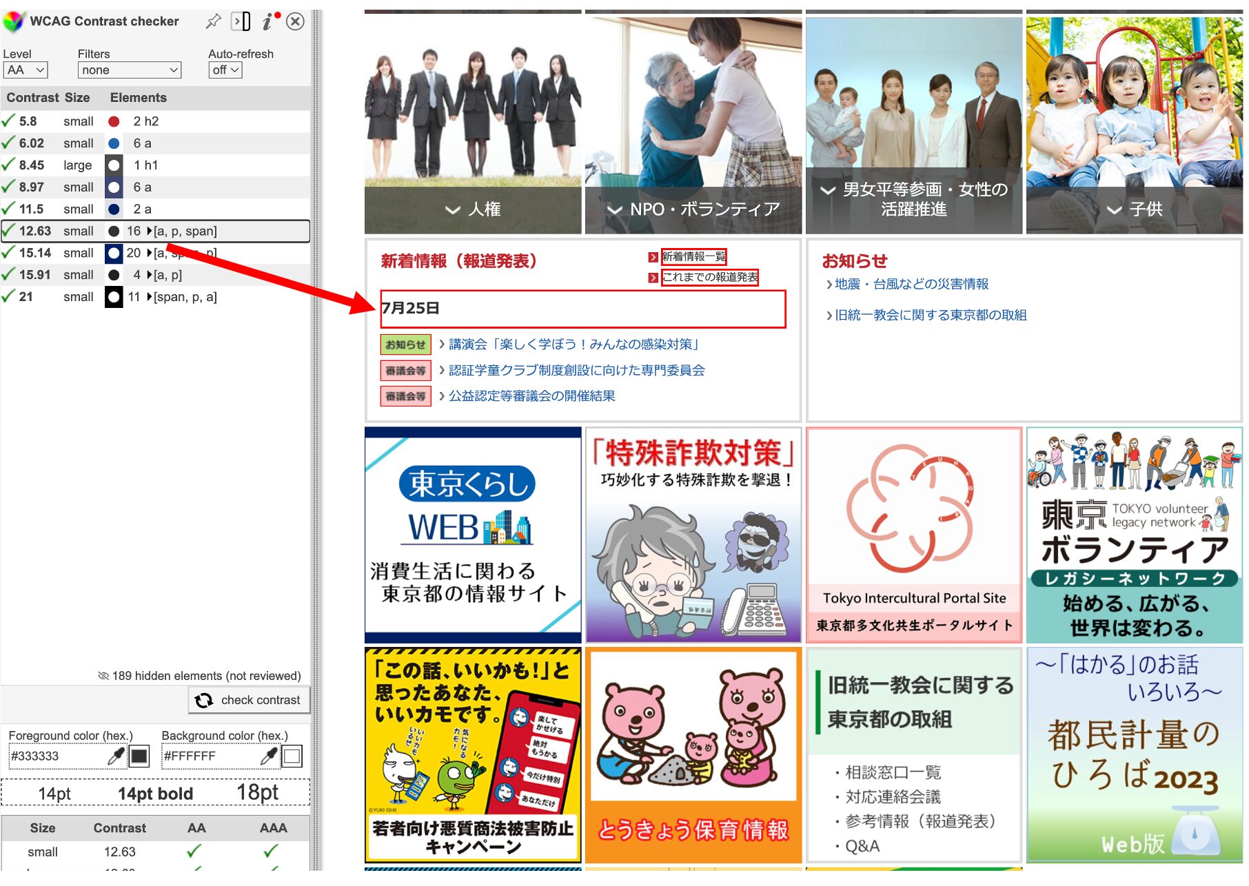
Google Chrome Add-on (Extension)It is a tool that can be used for this purpose. It instantly extracts the colors used within a website page, evaluating the contrast of each color. Since it allows checking on a per-page basis, it is easy to use for checking websites in the testing phase as well as for maintenance of existing operational websites.
By clicking on any color displayed in the side control panel, it zooms in on the parts used on the page.You can easily check information-rich sites such as portal sites as well.。
Official Page:WCAG Color Contrast Checker
⑤ Contrast Grid
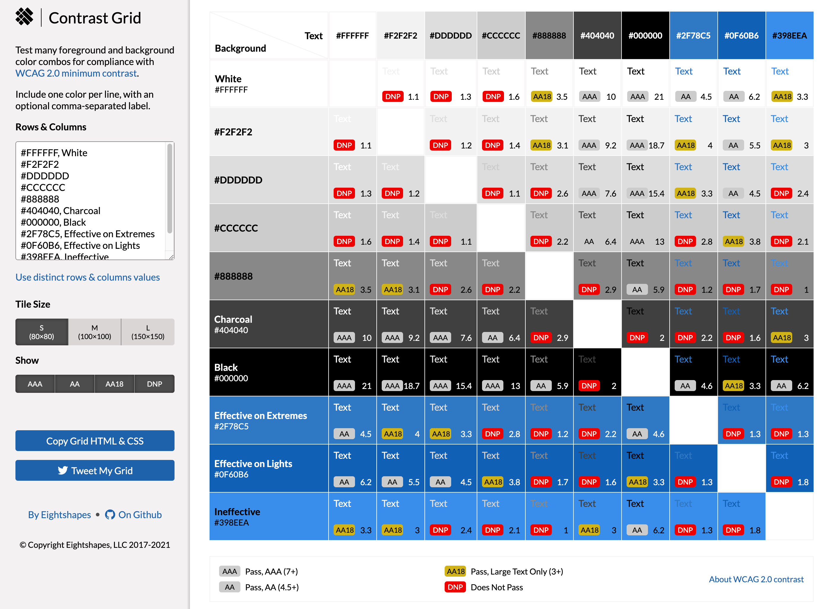
Many contrast checkers are tools that specify colors to check the contrast individually, but this tool isA color palette (list) is displayed, allowing you to select the desired combinations of contrast.Therefore, this method is recommended for beginners in design or those who struggle with color matching.
When you access the official site, the default color combinations are already displayed as shown in the figure above. By adding color codes to the left box, you can see combinations with other colors on the palette.Compliance levels such as 'AA' and 'AAA' are displayed as labels, with color differences indicating compliance status.Thus, the available combinations are also clear at a glance.
Official Page:Contrast Grid
I've just introduced five useful contrast checkers, but why is contrast verification necessary? Let’s explain next.
Why is contrast checking necessary?
In light of the obligation to provide reasonable accommodations under the amended Act on Elimination of Discrimination against Persons with Disabilities, which came into effect in April 2024,Web accessibility compliance is also a necessary measure.This was done. In this effort, we first need to verify the accessibility achievement level of our own site from various angles.
In particular, as websites contain a lot of information obtained visually, it is important not only for sighted individuals but alsoWe need to ensure that the site is accessible for users with low vision, the elderly, and those with color vision deficiencies, allowing them to recognize text and images.We must thoroughly verify whether web accessibility is ensured and make improvements as necessary.
One of the indicators necessary for that verification is"Color Contrast Ratio"It is. Contrast ratio is an indicator of the difference in brightness between two colors on the screen (usually the foreground and background colors). This ratio numerically represents the relative brightness of the two colors, with higher contrast ratios making it easier to distinguish colors. Generally,The contrast ratio is expressed in a range from 1:1 to 21:1, with higher values indicating stronger contrast, which means easier recognition.。
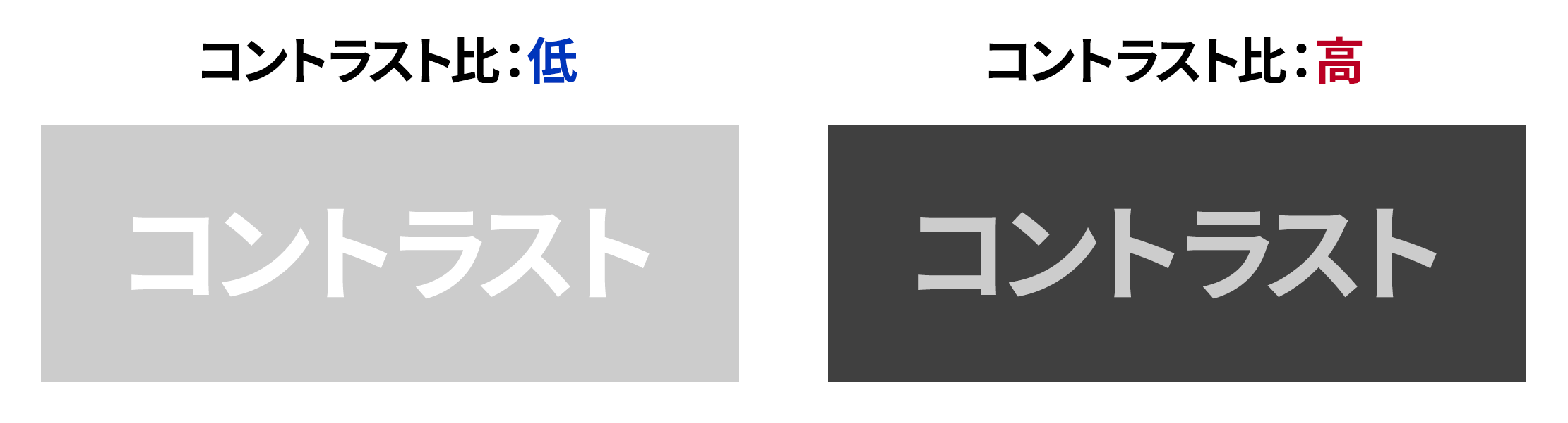
Now, regarding how much the appearance differs due to contrast ratio differences, please see below.
◆Differences in visibility due to contrast ratio
Additionally, as an image representing how text may appear blurred for someone with low vision, the image above has been blurred.
◆ Differences in Appearance When Blurry
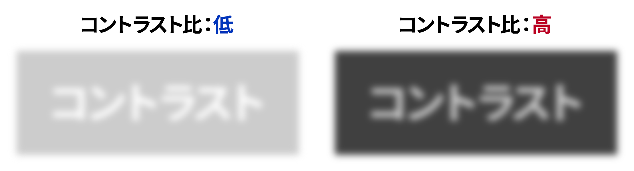
In this way,When the contrast ratio is high, the differences between the background colors and all colors are significant, making it easier to recognize color boundaries, thus increasing readability.For example, if the text color and background color are at a 1:1 ratio, they are indistinguishable as the same color, whereas at a 21:1 ratio, they are displayed in white and black, making them easily recognizable.On websites featuring various elements such as text and images, we must pay attention to contrast ratios down to the fine details to ensure web accessibility.。
Therefore, the contrast of your site's design isWhether the requirements for ensuring web accessibility are met.Conducting a contrast check is essential to determine this, but doing soTo make quantifiable decisions, a "contrast checker" is an essential tool.That being said, let’s explain the requirements for web accessibility in the next section.
Three Points for Contrast Checking
When using a contrast checker to verify the contrast ratio of websites or content, you should not solely rely on your own judgment.It is necessary to verify in accordance with the established web accessibility standards.Here, we will explain three points to keep in mind during contrast checking.
Point ① Understand the contrast ratio that meets JIS standards.
As mentioned earlier, the amendment of the Act on Elimination of Discrimination against Persons with Disabilities made it mandatory to provide reasonable accommodations, thereby making it essential for all businesses to ensure web accessibility.
There are various elements that make up a website, and each has established accessibility standards, with all success criteria defined by the international standard WCAG 2.0 (Web Content Accessibility Guidelines 2.0). In Japan,JIS standards (JIS X 8341-3:2016)This applies.
Furthermore, this standard specifies conformance levels from A to AAA, and according to the Ministry of Internal Affairs and Communications,Ensuring web accessibility must comply with AA or AAA (recommended).It is said.
Standards have also been established for contrast ratios.
◆Contrast ratio to comply with compliance levels AA and AAA
| Conformance Level | Required contrast ratio |
| AA | At least 4.5:1 |
| AAA | 7:1 or more |
In other words, as a website that complies with web accessibility,A ratio of at least 4.5:1 is required for the contrast ratio.Many contrast checkers automatically calculate the contrast ratio, so let’s be mindful of this ratio as we verify.
Note that the AAA contrast ratio of 7:1 is based on users whose vision has deteriorated to about 20/80, and W3C assumes that users whose vision has declined beyond 20/80 normally use assistive technologies to access content.
AAA is not mandatory but merely a recommendation.If you are considering the site usage of low-vision users and those with color vision characteristics who do not have assistive technology, you should design with a contrast ratio of 7:1 in mind.It is likely.
Reference: Understanding Success Criterion 1.4.6 | WCAG 2.0 Commentary (W3C)
Point ② Pay attention to font size as well.
As mentioned in Point ①, 'a contrast ratio of at least 4.5:1 is necessary', but in fact, there are exceptions to this.In the cases below, it is not always necessary to meet 4.5:1.
◆ Exceptions to Contrast Ratio Compliance Standards
・Exception ① Large text and bold text
For large text and bold text (normal text of 18 points or larger, or bold text of 14 points),The contrast ratio is 3:1If so, it meets the standard. This is because large text is considered to have high visibility, making it less of a problem if the contrast is slightly lower.
・Exception ② Decorative text and logos
Text or corporate logos used for decorative purposes are excluded from this contrast ratio requirement. These are used for design and brand recognition, not for conveying information.
・Exception③ Text within images
Text within photos or images also counts as exceptions. However,Important text for information provision should have an appropriate contrast ratio even within images.is recommended.
Point ③ Consideration for users with color vision characteristics is also necessary.
Until now, we have focused solely on the contrast ratio, but when considering color accessibility, the contrast ratio alone is actually insufficient. This is becauseConsideration for users with color vision characteristicsmust also be considered.
For example, below is a lineup of buttons often seen in website email forms, and both buttons are designed with color combinations that conform to AA for the contrast ratio between background color and text color.
◆ AA-compliant Contrast Ratio Button

It is easy to think that "since the contrast ratio meets the standards, accessibility has been secured," but this is a hasty conclusion. Press this buttonType D Color Vision (Type 2 Two-color Vision)When viewed through the filter, it appears as follows.
◆ Appearance of Type D Color Vision Buttons

In this way,If the colors of two buttons are too similar, they may be difficult to distinguish at a glance.Even if the contrast ratio meets the standard, it does not necessarily mean that usability is good. In other words, when choosing colors, one must consider not only the contrast ratio but also color vision characteristics.
Additionally, in terms of consideration for users with color vision characteristics,Do not convey information solely through color differences.is also an important point to consider.
With Uniweb, users can change contrast on their end.
If you do not have resources to check the contrast of your own site, our companythe accessibility tool 'Uniweb',I recommend introducing it. Uniweb enables various accessibility features by simply adding one line of code to the website source.Same-Day Implementationa plugin type tool that can do so.
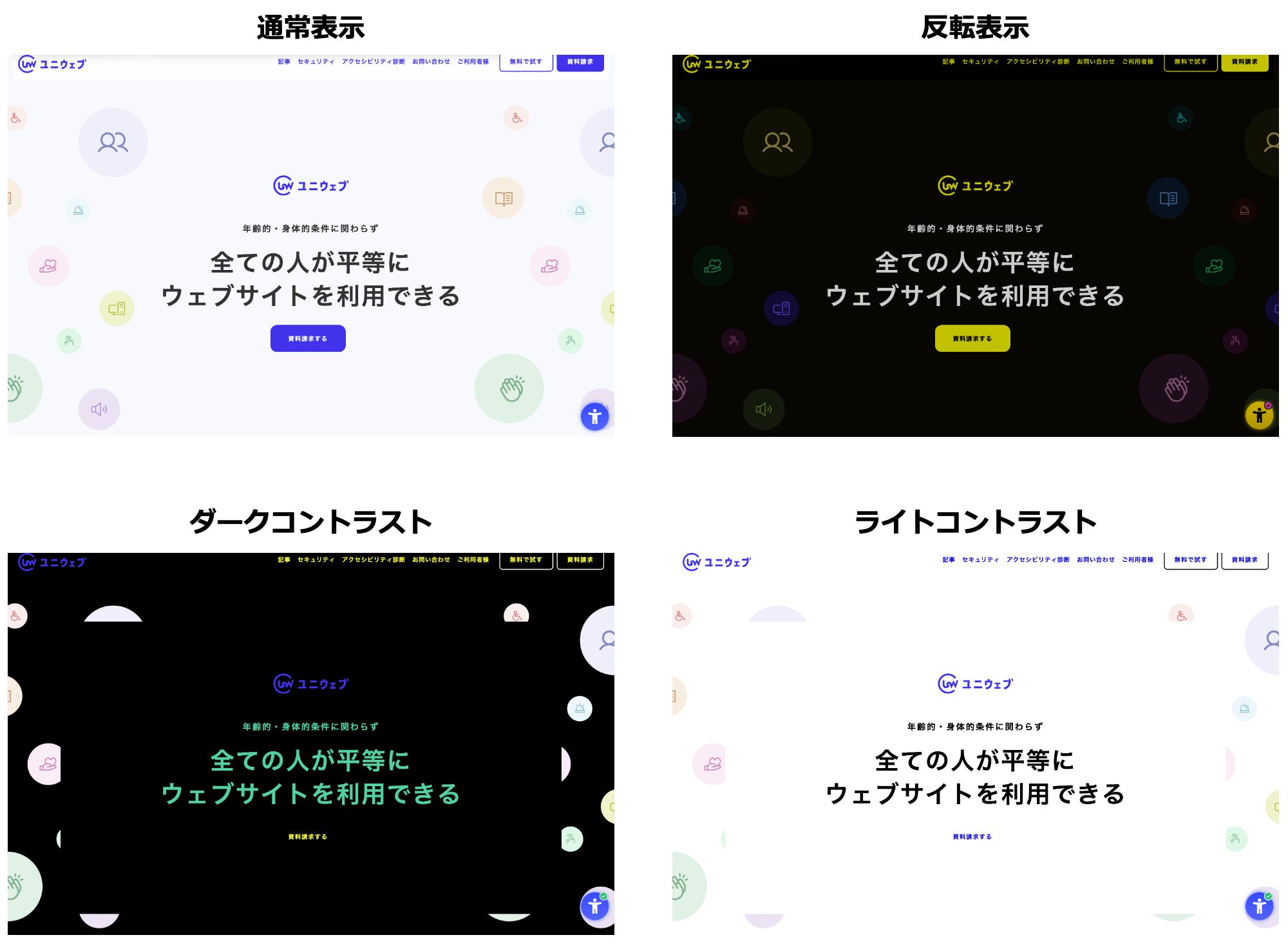
A major feature of Uniweb is thatUsers can utilize various accessibility features while browsing the website.You can also implement accessibility features that include contrast adjustment, and by clicking, you can easily switch between 'inverted colors', 'dark contrast', and 'light contrast' to enhance readability.
◆ Uniweb's Contrast Adjustment Feature
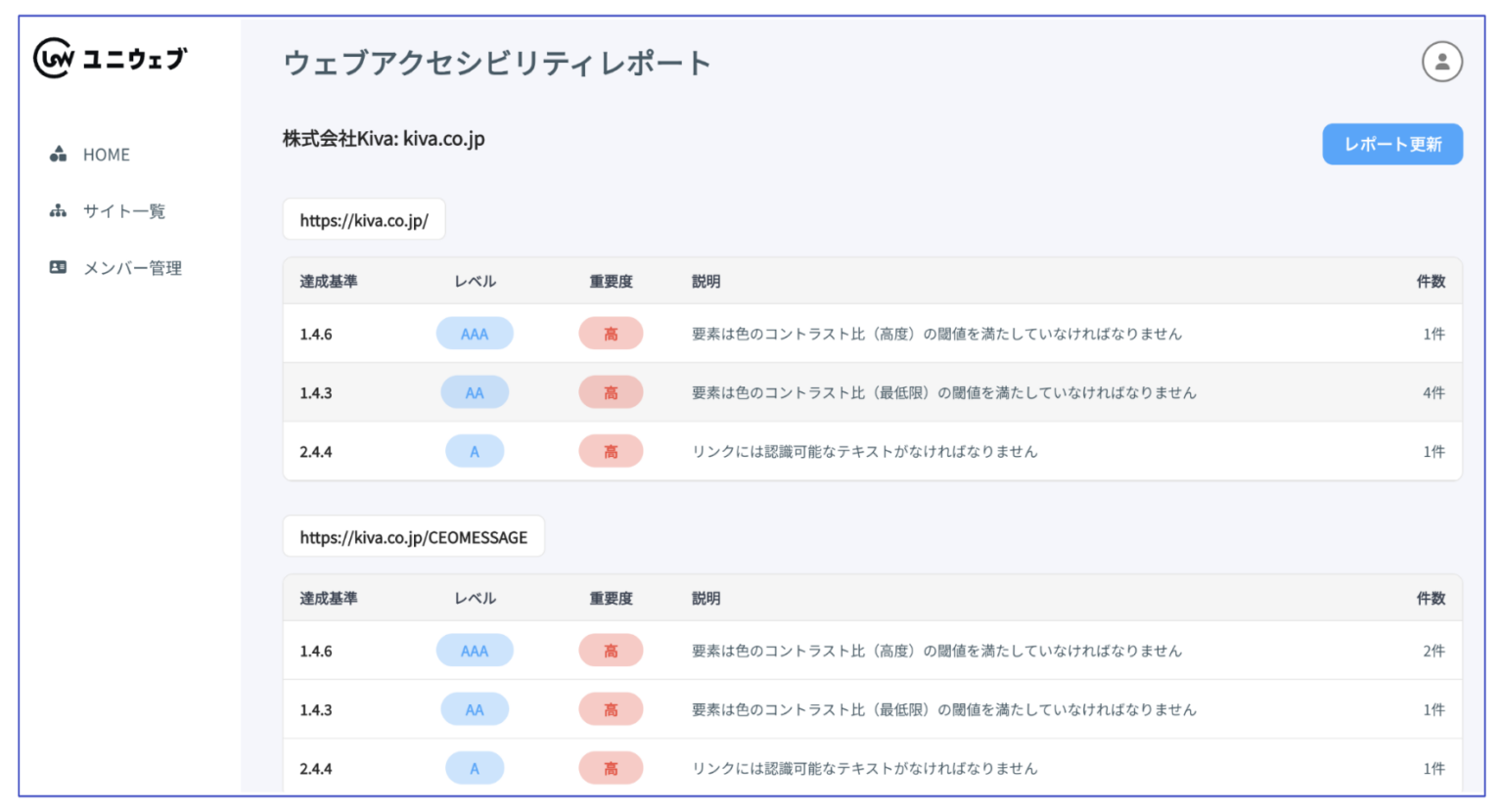
Additionally, in the management screen,Diagnostic report on the web accessibility compliance of the site.You can check this. The report shows the compliance level for each item (A, AA, AAA), and for sections that require corrective action, specific code modification methods are displayed.It allows for efficient operation without the need to specifically search for correction points with various verification tools.。
◆ Uniweb Management Screen
At the bottom right of this article,Click on the 'blue circular human-shaped icon'.If you do that, the accessibility menu of Uniweb will be displayed. In addition to contrast switching, various accessibility features are available, so please check out the actual functions of Uniweb.
Conclusion
In websites where information is primarily obtained visually,Ensure visibility and readability for all usersWe must do so. Therefore, we need to understand the necessary considerations for users with low vision, the elderly, and those with color vision deficiencies, and implement appropriate accessible design on our company's website.
Contrast checkers are very useful tools for achieving accessible design. Many are included in paid web accessibility check tools, butIf you only need a contrast checker, free tools are sufficiently useful.Therefore, let's start by checking your own site right away.
In this article, I focused on the verification of contrast ratios within web accessibility, butIf you want to know more about web accessibility, please refer to past articles on our site along with the "Web Accessibility Implementation Handbook" provided by the Digital Agency.。
Reference: Past article 'What web accessibility measures site managers must implement?'、Web Accessibility Implementation Handbook (Digital Agency)
Additionally, in our Uniweb,Free diagnostics for your company's website are also available.We are implementing it, so if you are a business considering web accessibility compliance for your own site,Link belowPlease feel free to apply.
Free Accessibility Diagnosis (Uniweb)

Popular Articles
-

Thorough illustrated explanation of 18 useful functions of AssistiveTouch
-
Explains how to use screen readers and five typical tools
-
Interaction design involves designing the exchanges between users and products.
-
13 types of "easy-to-read fonts" and 3 key points on how to choose one.
-
Eight "screen sharing tools" for novice users to choose from.


-
Contact Us
-
Request Info
-
Free Trial
-
Partner System