13 types of "easy-to-read fonts" and 3 key points on how to choose one.
2024/10/29

On Websites'Readable Fonts'is incredibly important for the site to be comfortably used by many people. The readability of fonts has a significant impact on user experience in web design.
Especially from the perspective of web accessibility, the proper selection and use of fonts is essential formeeting the WCAG guidelines and creating a website that is easy to use for all users.。
To be a readable font, the following two elements are important.
1. Visibility
2. Accessibility
Visibility refers to having appropriate font size, letter spacing, and contrast, allowing characters to be clearly recognized, while accessibility means whether fonts are easy to read, particularly for users with visual impairments or dyslexia.By choosing a font that balances these two factors, users can understand content smoothly without feeling visual strain.
This article will introduce:13 Representative Readable Fontswe will introduce and explain the characteristics of readable fonts, how to choose them, and specific methods to enhance web accessibility. Designers and engineers who are required to produce highly accessible content are encouraged to read this.
Table of Contents
- 1 13 Readable Fonts to Enhance Accessibility
- 2 Important Aspects of Readable Fonts: 'Visibility' and 'Accessibility'
- 3 Two Basic Elements of Readable Fonts
- 4 Three Key Points for Choosing Readable Fonts from a Web Accessibility Perspective
- 5 Three Practical Techniques to Improve Readability
- 6 Three Websites Implementing 'Readable Fonts'
- 7 Conclusion
13 Readable Fonts to Enhance Accessibility
In improving accessibility, choosing the right font for design is crucial. First of all,Readable Fonts from the Perspective of AccessibilityI will introduce 13 representative fonts.
◆13 Accessible Readable Fonts
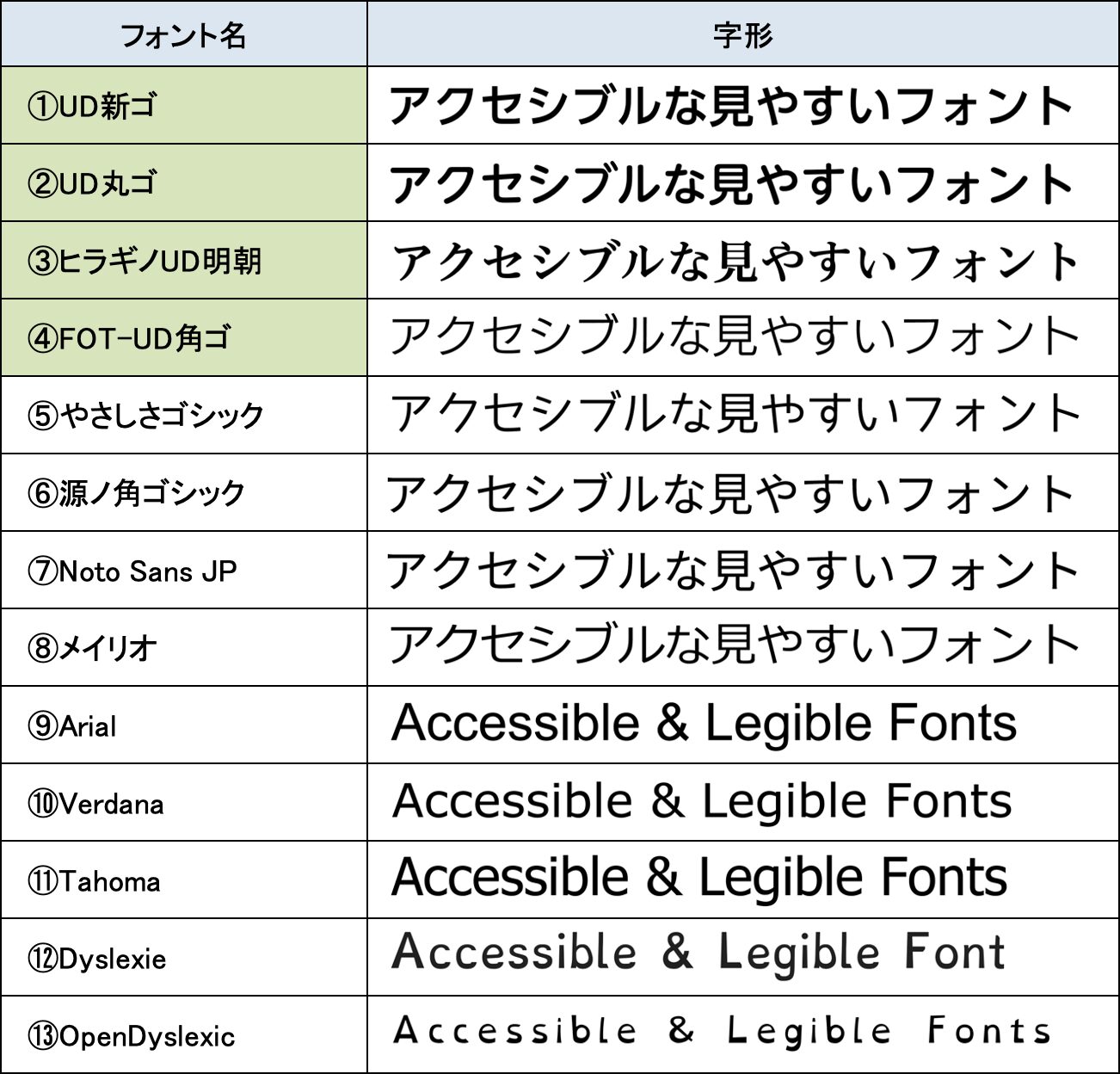
UD Fonts: Universal Design Fonts (1-4)
Please refer to the above table numbers 1 to 4 (green part).Fonts with 'UD' in their names are collectively referred to as 'UD Fonts: Universal Design Fonts.'
UD Fonts arefonts developed to be readable by all users.Yes. In particular,they are designed with consideration for users with visual impairments and dyslexia, simplifying character shapes and featuring designs that are easy to visually distinguish.。
UD Fonts are used, for example, in public signs and educational environments in Japan, demonstrating their high versatility and effectiveness in web design. Using UD Fonts allows for improved accessibility across the entire site.
Font 1: UD Shin Go
![]()
The Gothic-style UD Fonts are highly visible, especially inJapanese public facilities and signageand are widely adopted in various situations.
Font 2: UD Maru Go
![]()
The soft-looking Maru Gothic styleis used in educational materials for children and in situations where a friendly appearance is desired.This style is used in settings where visual strain is minimal and recognition is easy.
Font 3: Hiragino UD Mincho
![]()
Hiragino UD Mincho, with a blend of elegance and visibility, is designed with consideration for older adults and those with visual impairments.While preserving the beauty of Mincho typefaces, it is visually easy to readfont.
Font 4: FOT-UD Kaku Go

With clear character shapes and adjusted thickness and spacing, it is designed to be readable by anyone. People who easily feel visual strain can also read it smoothly, especially inpublic institutions, medical environments, and educational fields.Its use is recommended in such areas.
Other Readable Fonts (5-13)
In addition to UD Fonts, there are many fonts that prioritize visibility and accessibility. These fonts, while not specialized for specific disabilities,are excellent in visibility and versatility and are used in various digital environments and printed materials.
these fonts, commonly used across numerous websites and applications, serve as fundamental elements that enable all users to comfortably read content.By using them appropriately as part of the design, it can enhance the overall UX of the site.
Font 5: Yasashisa Gothic
![]()
Free Fontsare highly rated for their readability while being free. These fonts have thicker lines and moderate letter spacing, making them less visually tiring. While they are readable, they also carry a casual impression, making them suitable foreducational materials for children and web design.They are also used for these purposes.
Font 6: Genno Kaku Gothic
![]()
An open-source font co-developed by Adobe and Google, this is a very readable Gothic typeface. While the design is simple, it pursues readability,and is suitable for global web design and apps due to its support for not just Japanese but multiple languages.
Font 7: Noto Sans JP
![]()
Like Genno Kaku Gothic, this open-source font developed by Google emphasizes readability in Japanese. It maintains a consistent design across many languages, including Japanese,and is widely used in web pages, applications, and printed materials.It is utilized across a wide variety of formats.
Font 8: Meiryo

Originally developed as the standard font for Windows Vista and later versions,it particularly emphasizes visibility on displays. The spacing of characters is adjusted automatically, significantly enhancing readability on screens.It is optimized for web pages and software UIs, ensuring that displays on monitors are particularly clear and readablemaking it outstanding in terms of web accessibility.
Font 9: Arial

Having long been used as the standard font for Windows, it is nowa font widely used around the world.It has high visibility,and is frequently employed in digital media and printed materials.With a simple design, it is utilized across many mediums as a font that prioritizes readability.
Font 10: Verdana

A font designed to be readable even at small sizes,it has wide letter spacing, ensuring high visibility on screens, and is commonly used in web pages and digital content where readability is critical.
Font 11: Tahoma

Similar to Arial and Verdana, these fonts have narrow letter spacing but excel in visibility and readability. Particularly,they feature uniformly wide characters, making them suitable for screens with limited display space.It has been established.
Font 12: Dyslexie

Dyslexie is a font designed for people with dyslexia.It features unique shapes for each letter, making it easier to read by reducing the confusion between characters.Each letter has a unique shape, providing legibility by making it difficult to confuse letters.
Font 13: OpenDyslexic
![]()
An open-source font designed for people with dyslexia, just like Dyslexie.The design emphasizes the lower part of the letters, making them appear stable and easy to read.The text is designed to be read smoothly.
In addition to UD fonts, many other accessible and readable fonts are available.Choosing the right font according to the context, medium, and user needs is important.is important.
Next, I will explain specifically what constitutes a 'readable font.'
Important Aspects of Readable Fonts: 'Visibility' and 'Accessibility'
What is important for a 'readable font' is'visibility' and 'accessibility.'.Both are important concepts related to fonts, but they have different meanings.。
Visibility
Visibility refers tohow clearly and easily the characters can be seen and read.Fonts with high visibility have clear character shapes, making them easy to read for everyone, with letters spaced appropriately for quick recognition. Generally,fonts that are neither too thick nor too thin, and have well-defined shapes stand out in visibility.
Accessibility
Accessibility refers to whether fonts and texts are easy for anyone to access, meaning'whether they are easy to read and understand for everyone.'It aims to ensure comfort for all users, including those with visual impairments, dyslexia, and the elderly.
Fonts with high accessibility are not only visible, but also user-friendly for specific users,and are designed to work well with assistive tools like screen readers.
By balancing visibility and accessibility, they become readable fonts that are accessible to many users,making both central considerations in font selection that greatly affect the quality of web design and printed materials.
Next, I will explain what elements of fonts are necessary to ensure visibility and accessibility.
Two Basic Elements of Readable Fonts
Here, we will discuss the specific efforts to achieve barrier-free accessibility from two perspectives: the basic elements of fonts that ensure visibility and accessibility.There are two main important elements.
Element 1: Font Size
Font size greatly affects how readable characters are. Text that is too small can strain the eyes, presenting significant challenges especially for low-vision users and the elderly.
In general,it is recommended that text be at least 16 pixels in size on the web,which serves as a basic guideline to ensure readability. Please refer below for the differences in various pixel sizes.
// Differences in font sizes on the web
| 10px | The font size of this text is 10px. |
| 12px | The font size of this text is 12px. |
| 14px | The font size of this text is 14px. |
| 16px (minimum recommended size) | The font size of this text is 16px. |
| 18px | The font size of this text is 18px. |
| 20px | The font size of this text is 20px. |
On websites, for example,headings are often composed of bold 20px text while the body text is 16px,and such distinctions are common. Choosing an appropriate font size is one of the most critical factors in ensuring comfortable readability for everyone.
Element 2: Typeface
Fonts mainly have two styles:sans serif and serif.There are, for convenience,they can be considered as Gothic and Mincho types in Japanese fonts.It's acceptable to categorize them this way, as each style is suited to different uses and situations.
// Sans serif and serif
| Sans serif | Serif |
 |
 |
Sans serif has no decorative elements at the edges of the letters, which gives it a simple design.It is characterized by its simplicity.Yes. Especially,the visibility in digital environments and at small sizes is high,making it commonly used in websites and mobile apps.It is common to use sans serif for on-screen display.
On the other hand, serif fonts have small decorations (serifs) at the edges of the letters,which makes them suitable for printed materials and long texts.Serif fonts offer a smooth and rhythmic impression throughout a text,and they are often used in traditional and formal contexts.However,they may have poor visibility at small sizes on a display.
When considering accessibility in digital environments like websites, sans-serif fonts (gothic type) are more suitable. However, for long reading or readability in texts such as books, the smooth and comfortable design of serif fonts (mincho) is beneficial. As mentioned earlier,'Hiragino UD Mincho,' for instance, is designed with clear details in the Mincho type, ensuring accessibility while providing an aesthetically pleasing and calm impression.
Thus, it is important to choose fonts that enhance accessibility while maintaining the overall tone and impression of the document, not just focusing on visibility according to the medium and situation.
Three Key Points for Choosing Readable Fonts from a Web Accessibility Perspective
Now, I will explain three points about how to choose or use readable fonts with a focus on web accessibility.
Point 1: Based on WCAG Guidelines
WCAG (Web Content Accessibility Guidelines) are established guidelines to make web content accessible to everyone.These guidelines ensure that web content is accessible to all users.It is essential when selecting fonts for web accessibility,the standards outlined in the WCAG.。
One example of a guideline is that the contrast ratio between the background and text color should be 4.5:1 or higher. This ensures that users with visual impairments or color vision deficiencies can clearly read the text.
Additionally, a font size of 16px or larger is recommended to prevent the text from becoming too small and losing clarity, thus making it difficult to read. Furthermore, on displays, sans-serif fonts (gothic type) are generally more legible than serif fonts (mincho), hence the use of sans-serif fonts is recommended.
In choosing and using fonts,meeting these guidelines from the WCAG will help create a website that is easy for everyone to use.For more details on WCAG, please refer to the article below along with this one.
Related Articles:WCAG is an international standard for accessibility based on four principles.
Point 2: Ensure Font Scalability
To enhance web accessibility, it is important that fonts are scalable. In other words,users must be able to adjust the font size using browser settings or zoom functionality.are required.
When specifying font sizes in web development with CSS, using relative units like 'em' or 'rem' instead of absolute units like 'px' allows users to freely change the text size.
Furthermore,fonts that are designed to prevent layout issues across different devicesit can be said that it has higher scalability. For instance, when viewing a well-structured website on a PC on smaller screens like smartphones or tablets, it is necessary that the fonts do not distort or break.
Point 3: Compatibility with Screen Readers
It is important to choose fonts that work well with screen readers which users with visual impairments use to access web content.Fonts that function well with screen readersare crucial to select.
While there isn't a clear specification distinguishing between screen reader-friendly and unfriendly fonts,overly decorative fonts or special fonts that include symbols or emojis may not be correctly recognized by screen readers.Therefore,using simple sans-serif fonts or standard fonts (like Arial or Verdana) can help reduce the risk of confusion during screen reading.。
Additionally, using appropriate page structures, HTML tagging, and alternative text will ensure that screen readers function properly. For more information on screen readers, please refer to the articles below.
Related Articles:Explains how to use screen readers and five typical tools
Beginning with the choice of such fonts,specific methods for web accessibility based on WCAGand so on, can be found in the following‘Web Accessibility Implementation Guidebook’ (published by the Digital Agency).This is detailed, and I strongly recommend designers and engineers to review it thoroughly.
Reference: Web Accessibility Implementation Guidebook
Next, let’s discuss specific techniques to enhance font readability.
Three Practical Techniques to Improve Readability
When using fonts in practice, several important points should be kept in mind. Here, I will introduce three practical techniques to improve font readability and explain what specific adjustments are effective.
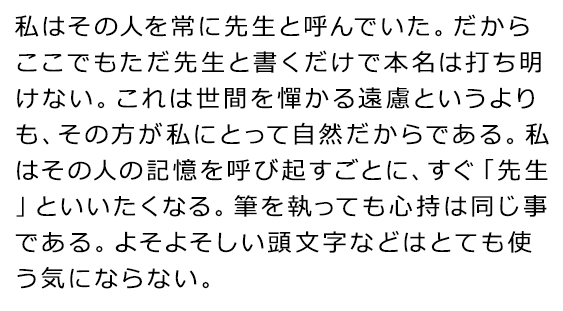
Technique 1: Adjusting Line and Letter Spacing
Proper adjustment of line spacing and letter spacing is a key factor in significantly improving text readability.If the line spacing is too narrow, the letters will appear cramped, making it difficult for the eyes to move smoothly.As a result, this increases the burden on readers, making the text harder to read. Conversely,if the line spacing is too wide, the consistency of the text is lost, and it becomes difficult to focus on reading it.。
Below is a text written in the same font size (Meiryo) with only line spacing and letter spacing adjusted.
◆Differences in readability due to line spacing and letter spacing
| Line spacing and letter spacingAppropriateText | Line spacing and letter spacingInappropriateText |
 |
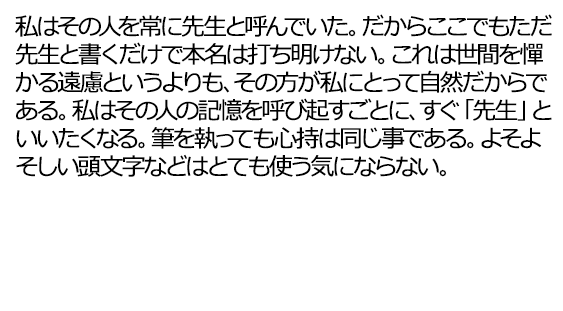 |
Generally,the ideal line spacing is about 1.5 to 2 times.(The left figure above shows line spacing at 1.5 times), creating a setting that is comfortable to read without cramping the text. Similarly, letter spacing (kerning) also needs adjustment.When characters are too close together, they can blend together, particularly reducing visibility in smaller font sizes.Adequate letter spacing helps clarify the distinction between characters, maintaining readability.
By allowing space in line and letter spacing, along with appropriate line breaks and indentation, the readability of the font and text can be further enhanced.
Technique 2: Creative Use of Contrast and Color
The contrast between text and background is a significant factor affecting visibility. High contrast, such as black text on a white background, is the most visible and easy to read for everyone. Conversely,when the background color and text color are too similar, or in low-contrast combinations (for example, light gray background with white text), the text can become difficult to see,which can make it difficult for users with low vision or other visual impairments to understand the displayed content.
The following shows a comparison of images with the same color tone at different contrast ratios,and it is clear that higher contrast ratios are more readable.。
◆Differences in visibility due to contrast ratio

Additionally, choosing colors that consider users with color vision characteristics is important. Avoid combinations like red and green, and follow the WCAG guidelines to maintaina contrast ratio above 4.5:1.Aim to ensure that the overall color scheme is accessible, as this contributes to improving font readability.
When designing while maintaining an appropriate contrast ratio, using a tool called a 'contrast checker' can be efficient.Useful contrast checkers are introduced in the articles below, so please take a look if you are interested.
Related Articles:Five easy-to-use "contrast checkers" for those in charge
Technique 3: Consistency and Differentiation in Font Use
Maintaining font consistency in websites and printed materials is essential for readers to smoothly comprehend the information.Using different fonts throughout the text can lead to visual confusion and contribute to making the content hard to read.Especially by using a consistent font for main content and headings, the flow of information becomes clearer, maintaining a cohesive design.
On the other hand, there are situations where varying the fonts can be effective. For instance,using different fonts for headings and body text can create a visual distinction, making important information stand out.However,overusing too many fonts can reduce visibility and may hinder smooth understanding, soit is crucial to choose them carefully.
Up to this point, I have explained in detail about readable fonts. Next, I will introduce some websites that actually utilize accessible fonts.
Three Websites Implementing 'Readable Fonts'
Here, sites that enhance overall web accessibility through fonts that excel in visibility and accessibility are introduced.Three websites that improve their overall web accessibility.These sites are recognized for their selection of accessible fonts and design.
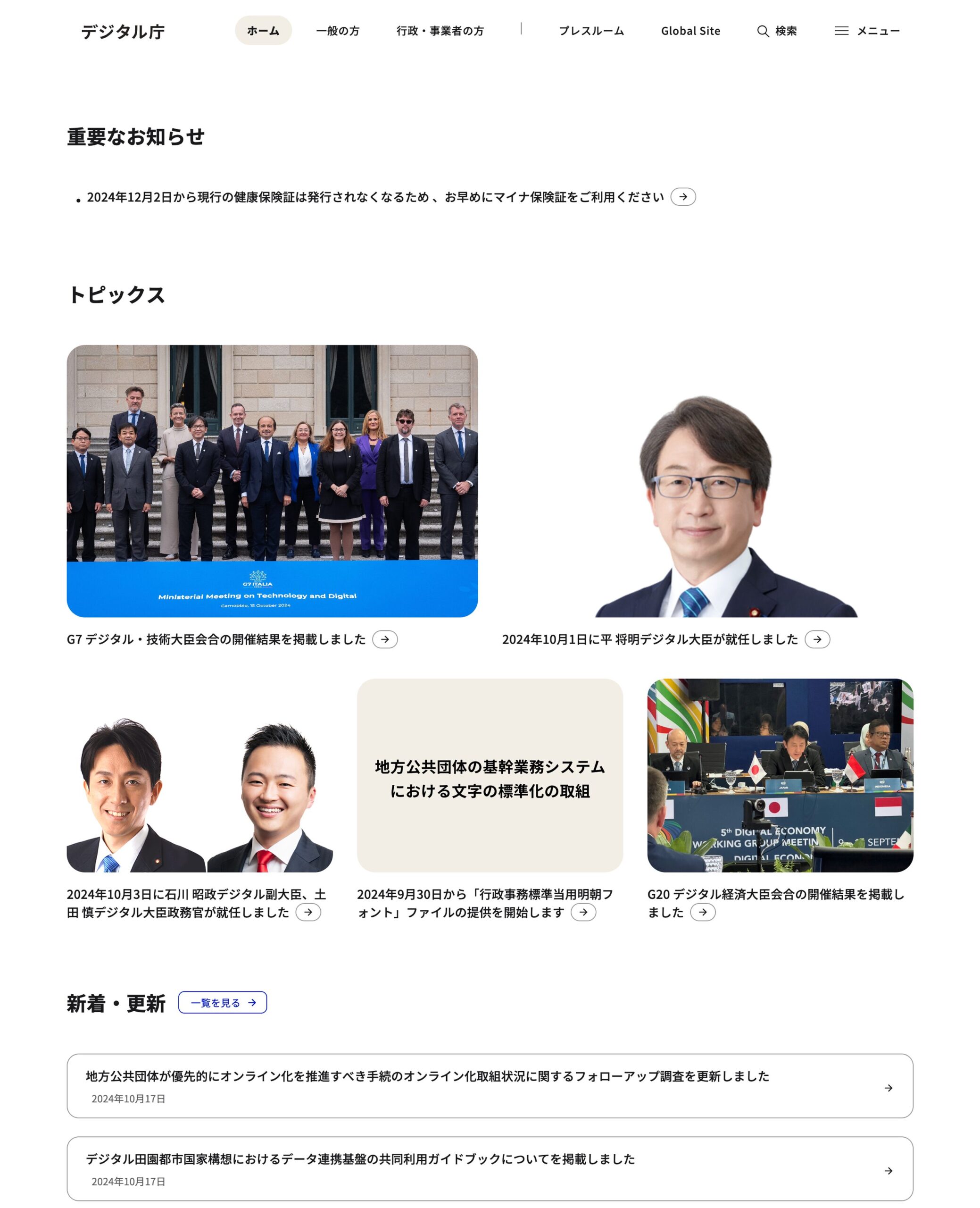
Site 1: Digital Agency
The official website of the Digital Agency adopts a design focused on accessibility. The font used isthe open-source font 'Noto Sans JP', which considers visibility and accessibility.
In addition, many accessibility improvements have been implemented, such as organizing heading structures for screen reader users and facilitating reading of PDF files. Such efforts ensure a comfortable experience for visually impaired users.
◆Official Website of the Digital Agency
Site 2: Apple
Apple’s official site, which emphasizes accessibility in its products and services, is a prime example highly regarded for being user-friendly.With appropriate color schemes and font sizes, along with sufficiently provided margins,readability and accessibility have been thoroughly considered.
Utilizing a simple and clear design based on high-contrast monochrome color schemes, a sans-serif typeface (Gothic font) is adopted, presenting product and support information in a highly readable manner.
◆Official Website of Apple

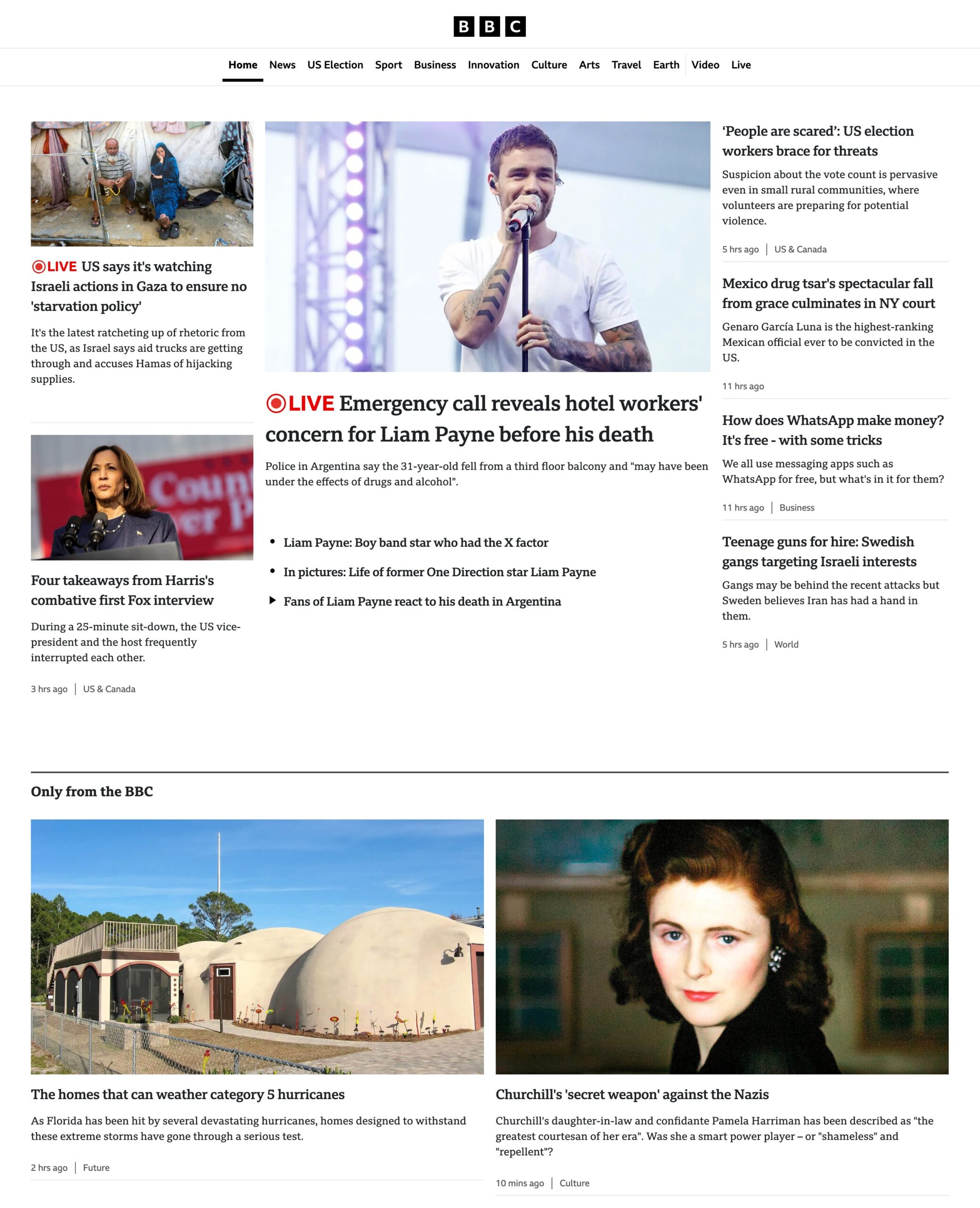
Site 3: BBC
The BBC's website has taken thorough care regarding font readability in delivering news content.It uses a custom font called 'Reith', which gives a formal impression while ensuring readability.
It also features functions for adjusting font contrast and size, creating a user-friendly environment. Furthermore, the BBC is a model website for adhering to WCAG standards in accessibility.
◆Official Website of BBC
Conclusion
The key point when selecting readable fonts is to enhance both ‘visibility’ and ‘accessibility’ simultaneously.When visibility is high, anyone can quickly recognize text and smoothly access information. On the other hand, if accessibility is ensured, users with visual impairments, reading disabilities, or the elderly can comfortably read text.
What designers and engineers should focus on next is, first,font selection based on the WCAG guidelines.This can reduce users' visual strain by considering contrast ratios and font sizes. It's also important to design text to avoid distortion on different devices.
In addition to that,it is necessary to check, through screen reader validations, user testing, and A/B tests, how readable users actually find the font,and to make appropriate improvements.
From now on, it is important for websites to focus on choosing accessible fonts so that all users can comfortably use websites and applications.

Popular Articles
-

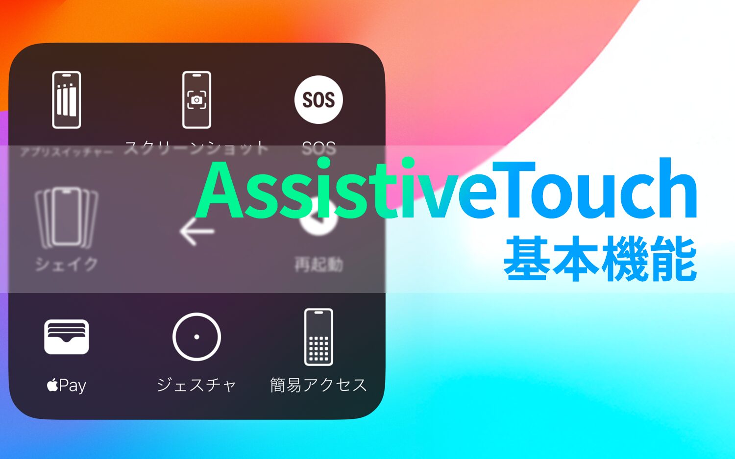
Thorough illustrated explanation of 18 useful functions of AssistiveTouch
-
13 types of "easy-to-read fonts" and 3 key points on how to choose one.
-
Eight "screen sharing tools" for novice users to choose from.
-
Explaining 5 Methods to Achieve 'Reading' on Websites
-
Comparison of Siri, Google Assistant, and Alexa voice assistants


-
Contact Us
-
Request Info
-
Free Trial
-
Partner System